Quick Guide to Customizing & Navigating ATAK
A guide to navigating the ATAK app
This page describes the interactions of key elements of the ATAK user interface. This will help developers unfamiliar with ATAK feel comfortable interacting with the app.
You can find the official ATAK User Manual PDF by following the steps below:
- Open up the hamburger menu (Tools) and select “Settings”
- Scroll to the bottom Support category and select the item “with Support & Program Documentation”
- At the bottom tap the “ATAK User Manual” option to open the pdf
Terminology
The figure below highlights the UI elements in ATAK. If you have access to the TAK Gov website you can get the latest info on terminology here.
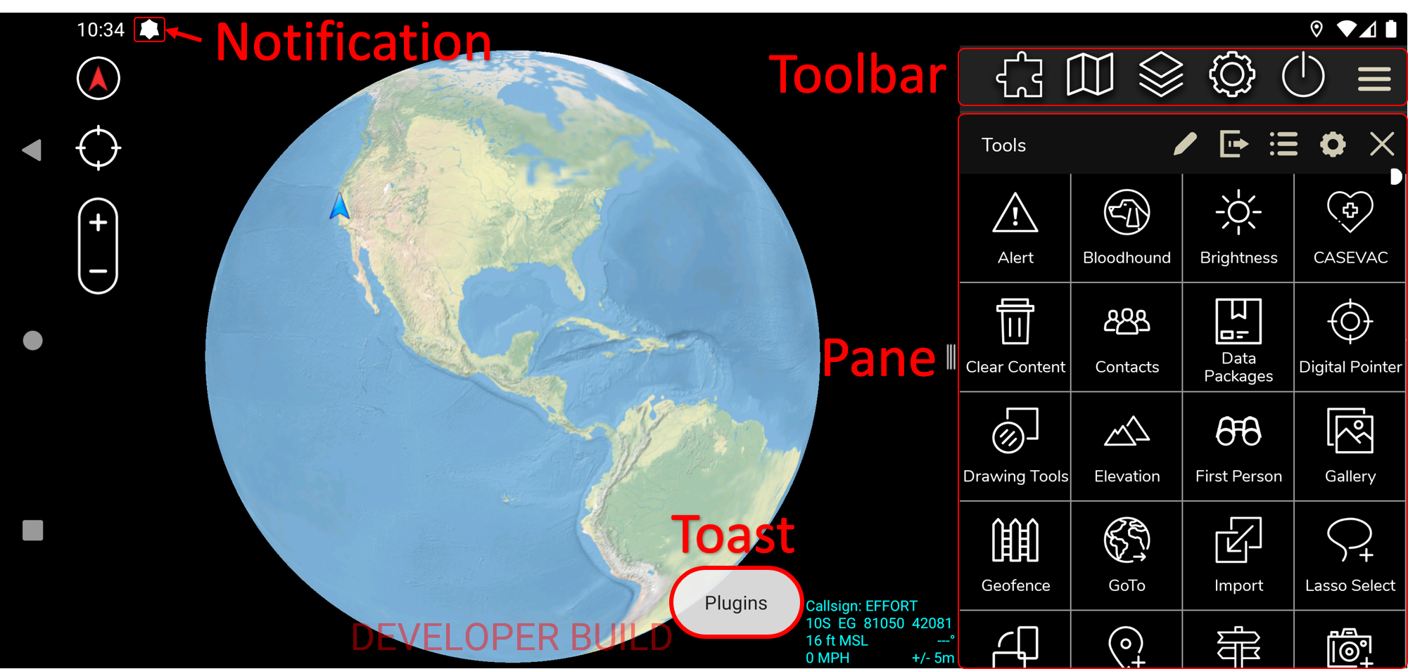
Toolbar & Toolbar Items
The ATAK toolbar is located in the top right or left of the screen depending on how the device is configured. The toolbar can host a specified number of toolbar items before overflowing the rest into the toolbar pane. Toolbar Items are clickable button objects with text and an image. They are the entry point for users to access ATAK tools or third-party plugins. The toolbar and toolbar items are shown on the upper right corner of the figure above.
Long tap / tap-and-holding the map will toggle the visibility of the toolbar. You can also long tap the icons in the static toolbar to display the name of the tool or plugin as a toast message. To edit the main toolbar click on the hamburger icon to open the tool pane. Click on the pencil icon to edit and create a new toolbar to drag your preferred toolbar items onto the primary toolbar. Follow the prompts to save your toolbar when finished.
Pane
The pane is a window inside ATAK application that is tightly coupled to other UI regions of the application and is where a plugin-supplied view is hosted within the ATAK application. Within the core API of ATAK, the pane is referred to in the SidePane class and its display state is managed by your plugin’s DropdownReceiver class. Typically the pane appears on the right side when in landscape mode and on the bottom when in portrait mode. The API methods showDropDown and resize can be used to configure the rendering position and size of the panel for your plugin. Using the back navigation of the phone (the back button) will clear the active side panel.
To maximize the screen real-estate for the pane in landscape mode, setting the Toolbar on the left provides more vertical space to fit content onto the pane. You can switch the toolbar side by going to Settings > Display Preferences > Tool Bar Customization > Tool Bar Side and toggling to the “Left”.
Toast
A toast is a UI element that presents a quick message to the user in a non-obtrusive display. It is convention within ATAK to add long-click listeners to your icon buttons to display a toast message about what function the button performs. This term is actually taken by the Android developer documentation (toast).
Notification
A notification is a detailed message to the user. It should be used to provide information to the user in a non-obtrusive way. ATAK utilizes the Android API notification which extends potential for interactive capabilities of your plugin’s notifications.
Prompt
A prompt is a direct message to the user that remains persistent until acknowledged by the user. They are similar to popup dialogs on websites or other mobile applications. ATAK utilizes the Android API dialog to create these prompts. You can also use the dialog for your own plugin prompts.
Setup Preferences
All of your preferences within ATAK can be saved, exported and imported by other ATAK devices to quickly configure new devices. If you have access to TAK Gov you can go to the following link to learn more about example preference files (*.pref).